Monday, February 20, 2017

Quant Assignment 2

Part 1:

In trying to decide which cycling team to invest money behind, either Team ASTANA or Team Tobler it is helpful to consider each teams range, mean, median, mode, Kurtosis, Skewness, and Standard Deviation.  Definitions of each of these are below:
  • Range: the difference between the highest and the lowest values in a set of data
  • Mean: the average or central value of a set of data found by adding all values up and dividing by the total number of values
  • Median: the middle or midpoint of a distribution of ranked values 
  • Mode: the value that occurs most frequently in a set of data
  • Kurtosis: how flat or peaked a curve of data is compared to the normal distribution.      -negative kurtosis (platykurtic): curve is flatter, is a negative number less than -1                  -positive kurtosis (leptokurtic): curve is more peaked, is a positive number greater than 1
  • Skewness: measures deviation of symmetry from the mean, can be either positive (longer tail to the right of the line for the mean) or negative (longer tail to the left)
  • Standard Deviation: statistical measure of how closely data values are to the mean in a set, a higher standard deviation means the data are spread out farther from the average
The data and calculations for each team are shown below:
Standard Deviation Calculations:
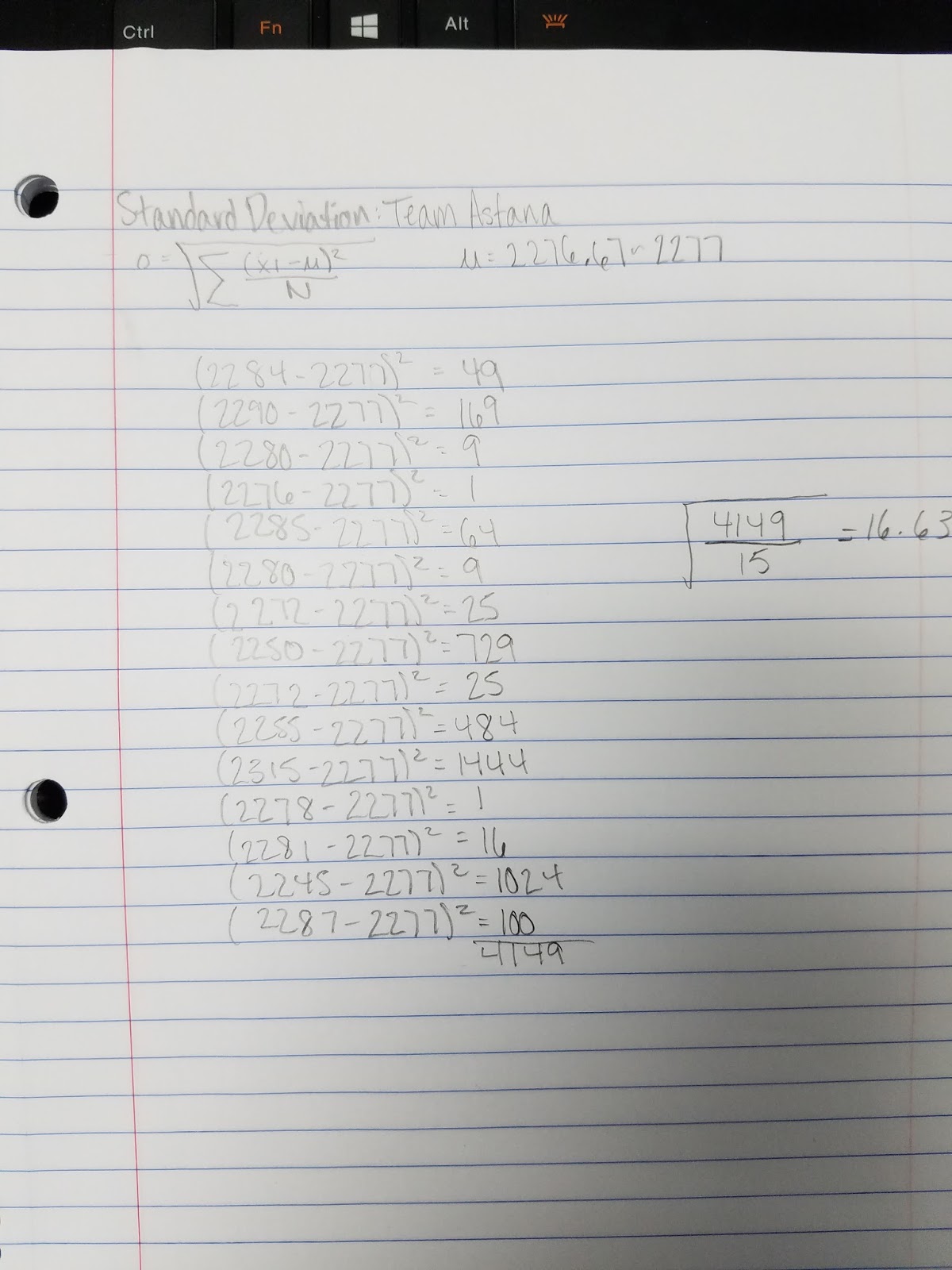

If the entire team that has the better race times gets more money per winning (400,000) and the team owner gets a higher percentage of those winnings (35%) then I would choose Team ASTANA.  Team ASTANA has the lower (fastest) average race time (37 hours and 57 minutes), beating Tobler (38 hours and 5 minutes) by 8 minutes.  The team also has the lowest sum for all its riders 34150 compared to 34282 on team Tobler.  Looking at Kurtosis, team ASTANA is relatively less peaked or close to 0, meaning the data for that team fall closer to the normal distribution.  Team ASTANA is also less skewed than Tobler.  This means that they have data that falls equally to both sides of the mean, indicating that they have riders that are really fast, but also slow.  However, this evens out to give a smaller mean, which means an overall faster team.  The fastest riders are carrying the weight for the team.  A more negative skewness shows that the data leans more to the right and there are relatively few lower numbers, which is what we don't want since low numbers means a faster score.  Lastly, although team ASTANA has a higher standard deviation, meaning it has numbers that fall farther from the mean, its fastest riders are causing the mean to be smaller.  It has riders that deviate more in each direction, which is also showed in the range, but generally it evens out to be a faster team.  Looking at the mean is the bests statistic to support Team ASTANA. 

Part 2:
For this part, population data for Wisconsin Counties was used to find the Geographic Mean Center and the weighted mean center for population in the years 2000 and 2015.  Geographic mean center finds the center of concentration of features using x and y coordinates.  The weighted mean center adjusts for the frequencies of data that are grouped together.  The map produced is shown below:
From the map, it can be seen that the geographic mean center at the county level is located almost exactly in the middle in the state in Wood County.  This is the central tendency, or the average of the x and y coordinates are located at this position.  After weighting the mean center with population data from 2000 and 2015, the mean center moved slightly to the south east to Green Lake County.  Taking the frequency of population into consideration changed the location.  Between the years 2000 and 2015 the mean center shifted very slightly to the west but is still found in the same county, Green Lake.  This could indicate that the population of counties to the west of the coordinate points for the 2000 mean center of population rose in a very small amount, or counties with a higher frequency of greater populations occurred to the west.


Wednesday, February 1, 2017

Quantitative Methods Assignment 1

Part One:

Nominal Data: this is data that is distinguished by a naming system to label variables.  This data is not usually measurable or quantifiable.  The map below contains nominal data because it uses names to differentiate the distinct climate zones across the globe and the variables do not contain numbers.
Source: http://esdac.jrc.ec.europa.eu/projects/RenewableEnergy/Images/Climate_Zone%2011_s.jpg

Ordinal Data: data that can be put into a ranking order or category based on position on an established scale.  The difference between rank can not be measured.  The map below shows an example of ordinal data because it is ranked into order in three categories with no way measuring the difference between each ranking.

Source: http://aldf.org/wp-content/uploads/2015/12/ALD-127-US-Protection-laws-rankings-map-2015-Large2.png

Interval Data: data that can be measured along a scale with each point being equal distance from one another.  Interval data can not have zero as a starting point and can not be multiplied or divided by.  The map below shows interval data because elevation does not have a starting point and each increment on the map goes up equally.

Source: http://topocreator.com/ned-jpg/city_a/600/mn.jpg

Ratio Data: Data that is measured along a scale with each point being equal distance from one another.  Unlike interval data, ratio data have a known starting point of zero.  The map below shows ratio data because the starting point is zero and progresses by intervals of 8 million.
Image result for equal interval map
Source: http://support2.dundas.com/OnlineDocumentation/RSMap/Images/DesigningMaps1.bmp

Part 2
In an effort to visualize where the numbers of female farm operators in Wisconsin are located and where there needs to be an increase in farming among females I have created the following maps.  Each map has a different classification method, therefore changing the look of the map.
The first map, shown below, uses equal interval classification.  Equal interval uses the range of data from highest to lowest and divides that by the number of classes desired, in this case 4.  Each interval will be the same size but might not have the same number of data in them.

Equal Interval


The next map was classified by Jenks Natural Breaks.  Natural Breaks finds the minimum variance in data by finding class breaks based off of differences in size of numbers in a set of data.
Jenks Natural Breaks

The last map is classified using the Quantile method.  This method places an equal amount of units in each class, unlike the equal interval method.

Quantile Method
The company should be targeting counties that are lightest in color, or have the fewest number of female farm operators, since these are the places which would benefit the most for marketing and have the most need to increase their numbers.  The map with the best classification method for the job is the Natural breaks map because it groups similar values the best to give a more accurate representation of the numbers of female farmers in each county.  It also keeps the intervals of classes with fewer female farmers smaller so it is easier to differentiate sizes and target these counties for marketing.  The last class can have a larger grouping because we are not interested in the counties with the highest numbers of female farmers.  From this map it is clear to see that counties in the northern portion make up the largest portion of the state lacking female farmers. 

Sunday, May 15, 2016

GIS Final Project

Goals and Background:
My spatial question for this project was: what areas provide suitable habitat for deer in La Crosse County Wisconsin?  Deer live in areas an appropriate distance away from major roads and urban areas, near water sources like rivers, streams and lakes, and in land cover types like forests, woody wetlands, and herbaceous cover.  Using tools like buffer, intersect, erase, and dissolve I will narrow down areas that have all the criteria in common. This information could potentially benefit hunters, wildlife enthusiasts, or members of the DNR who are tracking deer numbers in the county.  This project is important because it could be used for both recreation and ecological purposes.  Looking at the map, one will be able to easily identify exactly where the largest populations of deer should be or where their population needs to be controlled to go.

Methods:
I used the standard set of Esri data provided by ArcGIS that had been preloaded on the department server and added the cities, urban areas, highways, water bodies, rivers and streams, and county layers. I also found the vegetation layer on the Geospatial Data Gateway website entitled National Land Cover Dataset by State.  I then selected La Crosse County from the counties layer and used this to clip all the other layers.  I changed the coordinate system of the data frame to NAD 1983 State Plane Wisconsin South FIPS 4803 and projected all the other layers to match it.  Because my vegetation layer was a raster dataset, I had to use Raster tools to select the vegetation types of interest, which consisted of forest, herbaceous land, and woody wetlands and then clipped and projected it to match to other layers.  Then I used the raster to polyline tool because unlike the raster to polygon, it kept the cover types distinct and converted it to vector format so I could later intersect it.  I dissolved the internal boundaries that were in the urban and water bodies layers so it would not cause conflicts with the buffer later on.  I then used the buffer tool to buffer areas within 500 meters of rivers and streams and intersected that with the vegetation layer.  From this, I got a layer which showed suitable vegetation areas within a desired distance from water sources.  Next I made a 1000 meter buffer of the highways layer since this was an advisable distance from heavy traffic areas to avoid accidents, and erased it from my suitable vegetation layer and named the new layer Away From Roads.  I also made a 2000 meter buffer away from urban areas because deer should not be near cities and erased that from the Away From Roads layer.  This gave me my final layer of suitable habitat.  See figure one for work flow.


Figure 1: Work Flow for the Project with the final layer resulting in suitable habitat for Deer in La Crosse County, Wisconsin.


Results:
The result of my work shows area in La Crosse County that can be easily and safely inhabited by deer (figure 2).  The final layer shows land area near streams and rivers, in the proper vegetation types for deer, and away from highways and urban areas.   This area is the proper area for deer to live and avoid dangerous encounters with humans like car accidents


Figure 2: Final Map of Suitable Habitat for deer in La Crosse County, WI


References:
 Esri data base. USA Data. 2013., 5/2/2016.
  Geospatial Data Gateway. National Land Cover Dataset by State. 2011., 5/2/2016


Monday, May 2, 2016

GIS 1 Lab 5

Goals and Background:
The goal of this lab is to determine which vector geoprocessing tool to use in a given situation and apply that tool correctly.  In this lab, we will use the tools to find suitable habitats for bears in Marquette County Michigan. We will use GPS locations of black bears and fit their locations with a suitable forest habitat.  Other criteria like proximity to streams will also be used to determine the best habitat for bears.  The lab will also introduce basic scripting in python for ArcGIS with vector geoprocessing tools.

Methods:
To start, I downloaded the data and created a feature class for bear locations based off of XY coordinates from an excel sheet.  I then used the intersect tool with the bear locations and landcover feature classes to combine the bear ID and habitat type fields to find the three most popular habitat types the bears were found in.  Then I found how many bears were found within 500 meters of streams to determine if that was a popular location for them.  I buffered the streams and intersected that outcome with the bears locations.  The majority of bears were found near streams.  I then used the popular land cover types and the proximity to streams to find general suitable habitat for the bears.  I made a layer by selecting the bears three most popular landcover types and intersected that with the proximity to streams layer.  After dissolving the boundaries within the layer, I got a map of suitable bear habitat (figure 1).  The next objective was to find suitable habitat that was on DNR management land.  I used dnr_mgmt layer and used the clip tool to get it only within the study layer and not the whole county, and then the dissolve tool to get rid if the internal units.  Next I intersected the modified dnr_mgmt layer with the previous suitable bear habitat layer and got suitable land within dnr boundaries (figure 2).  The next step involved changing the suitable bear habitat layer to exclude areas within 5 kilometers of Urban or Built Up lands.  I selected Urban from the landcover feature class and dissolved it.   I then applied the 5 km buffer using the Buffer tool and used the Erase tool to erase it from the suitable bear habitat (figure 3).  For the second part of the lab, I used python scripting to find areas in Wisconsin that are suitable for the development of resorts (figure 5).  I created a 10 miles buffer around cities and wrote code to select by attribute for lakes greater than 5 sq. mi.  For the second task of part 2, I wanted to create potential impact zones of air pollution around interstates in Wisconsin.  In python scripting, I used code for a multiple ring buffer around interstates and created a graduated colors map (figure 6).

Results:


Figure 1: All suitable habitat for bear within the study area of Marquette county


Figure 2: Suitable land for bears within DNR management land in the study area


Figure 3: Suitable habitat for bear with a 5 km buffer from urban land


Figure 4: Final product showing suitable area and area with DNR management land


 Figure 5: python code for a buffer are lakes to find areas suitable for a resort


Figure 6: Air Pollution hazard index around interstates in Wisconsin using a graduated colors map.

Sources:
 Michigan Department of Natural Resources (DNR). 5.1.2016
 Price, Maribeth. 2016.  Mastering ArcGIS. 7th Edition data. McGraw Hill.
 Wilson, Cyril 2012, A comprehensive Lake features for Wisconsin, Unpublished data.


Tuesday, March 29, 2016

GIS 1 Lab 4


Goal and Background:
 This lab will focus on building and using query expressions to highlight useful data of interest from a dataset. During the lab, understanding and skill of attribute and spatial queries and how to use these in combination with each other will be showcased.  Multiple criteria queries will be built using Boolean expressions, operators, and parentheses and the resulting query data will then be successfully mapped. 


Methods:
For part one of the lab I added a U.S. counties layer to the map and then used the select by attributes tool to create multiple criteria queries.  When starting a query I kept the method to Create New Selection and then depending on what the next part of the query involved, I changed the method to either Add to Selected Features (if I wanted results including the selected features but outside of them as well) or Select from Selected Features (if I wanted results narrowed down inside the features that were already selected). Some of the criteria included county population and demographics.  For part two of the lab I downloaded a Wisconsin Dataset and made a multiple criteria query for cities with certain qualities within 2 miles.  For the next question of part two, I used a query to select the rivers assigned to select and then used the statistics option to find the total length of all the selected rivers.

Results:

Part One, Question 1:
 Counties with population between 3000 and 4000 people in 2010 and also all counties in 2010 that had a population density of at least 1000 persons per square mile. 

Part One, Question 2:
Counties in Wisconsin, Texas, New York, Minnesota, and California where male population is greater than female population and also for these states the number of seniors (age 65 and above) is over 6500.

Part One, Question 3:
 Modified the query developed in question 2 to add all other seniors in Washington, Maryland, Illinois, Nebraska, District of Columbia and Michigan who reside in counties that have more than 30,000 housing units to the result obtained in query 2

Part 2, Question 4:
Cities in Wisconsin with population (2007 population)  between  15,000 and 20,000 people, area of the city is at least 5 square miles in land area, and also female population is greater than males, and also the cities are within 2 miles of a lake.

Part 2, Question 5:
Rivers selected: CHIPPEWA R, EAU CLAIRE R, EMBARRASS R, FISHER R, HUNTING R, KINNICKINNIC R, MAUNESHA R, MILWAUKEE R, MOOSE R, NAMEKAGON R, PELICAN R, PLATTE R, and POTATO R.  Total Length is 137937 Miles.


Sources:
Price, Maribeth. Mastering ArcGIS. 7th ed. N.p.: McGraw Hill, 2016. Web. 7 March. 2016.


Esri. Online Wisconsin data. Web. 28 March. 2016.