Part One:
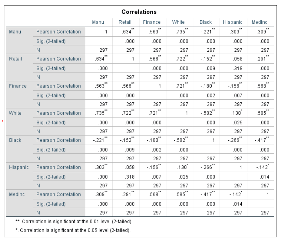
For the first part of the assignment, correlation between various census tracts and population data in Milwaukee, WI were measured. Correlation measures the association between pairs of variables. If we look at the Pearson Correlation, or how two variables change together, we can find strength, directions, or probability. Strength of a correlation between two variables, or the Pearson's r value, ranges from 1, indicating the strongest correlation, to 0, indicating no correlation. Picking out examples from the table above, if we look at the number of retail employees and the Hispanic population, the Pearson's Correlation is .058. Because this value is in the 0 to .29 range, we can say that there is no correlation between the Hispanic population in the area and the number of retail workers. This also means that it has no direction because there is no correlation, or a null relationship (Figure 1 below). A null relationship means no difference in changing values of Retail Employee numbers and Hispanic population. If we look at the relationship between retail employees and white population, the Pearson value is .722 indicating a high strength correlation, with the direction of the scatter plot being positive (Figure 2 below). The significance level of .000 for this variable shows that it is highly significant because it is basically 100% and the two stars in the table indicate that in order to be significant, it must have 99%. This significance means that we can reject the null, stating that there is a difference between the values for retail and white population. So from this we can conclude that there is a significant strong correlation between numbers of retail employees and white population in census tracts in Milwaukee, or that higher numbers of retail employees are present in areas with higher white populations. Another example we could look at is the relationship between median household income and black population. The Pearson value for this is -.417 indicating a low, negative correlation as the scatter plot shows (Figure 3). It is also given that this value is highly significant as well so we can reject the null and show that there is a changing difference between the variables. This means that there is a low correlation, or slight negative change as median household increases, black population in the tract decreases.
 |
| Figure1: Relationship between the number of retail employees and Hispanic population |
 |
Figure 2: Relationship between the number of retail employees and the white population
|
 |
| Figure 3: Relationship between Median household income and the black population |
Part 2:
Introduction:
Testing for spatial autocorrelation illustrates how a variable correlates spatially with itself and can determine patterns in distribution and likeness. Spatial autocorrelation determines the independence or randomness of spatial observations. This information can be useful for analyzing patterns of voter turnout. The Texas Election Commission has given data for 1980 and 2016 presidential elections, specifically democratic votes and turnout. The goal is to analyze patterns from the elections and determine if there are any patterns of clustering for voting data. This information will be used to determine how patterns have changed, if they have at all, over the 36 years. We will also take a look at the patterns of clustering as related to variables in population, such as the Hispanic population correlation. To do this, online correlation software including GeoDa and SPSS were used.
Methodology:
To begin this task, data had to be collected from the U.S. census bureau website. From the website, a shapefile of counties in Texas and a shapefile of Hispanic population 2015 data in each Texas county were downloaded. Because the Hispanic population shapefile contained data that was not necessary for the analysis, the ID row was deleted and all columns but the column containing percent of Hispanics in each county were deleted. Voting data with voter turnout for 1980 and 2016 and percent democratic vote for 1980 and 2016 for the state of Texas was provided for this task. Next, the data was then imported into GIS as Excel tables, joined with the Texas counties shapefile, and exported as another shapefile in order to use all the information collectively in GeoDa. Once in GeoDa, a spatial weight had to be created to determine spatial autocorrelation for the election data and Hispanic Populations. With the weight determined, the Moran's I scatter plot and LISA cluster maps could be created. The Moran's I plot compares the value of the variable at one location with the value at other locations. It can vary between -1 and 1, with positive values being closer to 1, meaning more clustered and a higher strength coefficient. Negative values mean data is less clustered. It is broken down into four quadrants with positive and negative numbers for comparisons. The LISA (local indicators of spatial autocorrelation) maps provide a way of visualizing this spatially. Both of these are used to measure what one place has in common with a neighboring place.
Results:
From the LISA maps, we can see that in the 1980 elections, there was a cluster of counties in the very southern portion of the state that had low voter turnout and were surrounded by other counties with low turnout as well. It can also be seen that counties slightly further north around the San Antonio area, and counties in the very northern portion of the state had clusters of high voter turnout (Figure 1). There was also a cluster of counties with low voter turnout surrounded by other low turnout counties along the middle, eastern side of the state. Compared to voter turnout in the 2016 election, results were somewhat similar. In 2016, the cluster of high-high voters in the very northern portion of the state got smaller by several counties. The low-low cluster on the eastern side disappeared. Comparing the Moran's I values, the 1980 value was .468 and the 2016 value was .2875. On the scatter plots, the points in 2016 also appeared more loosely associated. This means that in 1980 voter turnout was more positive, or clustered and 2016 was less clustered in comparison.
  |
Figure 1:(1980 on left, 2016 on right)
Next we can compare the percent of democratic votes in the counties between the two years 1980 and 2016. In 1980, the percent of Democratic voters had low-low clusters in the north-west portion of the state and in the San Antonio region. The very southern portion and various counties in the west, including a few around Dallas, had occurrences of high values surrounded by other high values. There were very few high-low and low-high relationships. In 2016, the percent of democratic voters had low-low clusters in the north central portion of the state, and the San Antonio region gained more white counties, or counties with no significance. The very southern portion of the state gained a few more counties with high-high values, and the very western portion of the state went from counties with no significance to a few larger counties with high-high values (Figure 2). The Moran's I value in 1980 was .5752 and the value in 2016 was .6855. This means that in 2016 the percent democratic voter patterns became more clustered, therefore the coefficient is higher. We can see this on the scatter plot in 2016 because the points fall closer to the middle of the chart Figure 3). This also shows that there is a higher clustering of low-low values, as most of the points fall in the bottom left corner, which indicates (-,-) values.


Figure 2: Percent Democratic Vote in 1980 on left, 2016 on right
 |
| Figure 3: Moran's I for 2016 Democratic Vote |
Lastly, we can compare both of the above results to make conclusions about how the Hispanic population has an effect on voter turnout and percent democratic vote. Looking at the LISA cluster map of percent Hispanic population in each county, the state is mainly divided up into two regions. The southwest portion has high values of Hispanic people surrounded by counties with other high values, and the northeast portion has low-low values. The Moran's I value is .7787, which indicates a positive relationship with a high amount of clustering. (Figure 4)

Figure 4
Conclusion:
From the results, we can see that voter turn out lost clusters of high values neighboring other areas of high values. We can also compare to Hispanic population clustering to note that the counties with high spatial correlation of Hispanic people have lower percentages of voter turnout. Running the data in SPSS, we can see that the Pearson Correlation value, which measures how two variables change together, is stronger in 2016 (-.637) than in 1980 (-.407) and both of these values are significant. This means that we can reject the null stating there is no difference and conclude that as percentage if Hispanic population gets higher, voter turnout gets lower, it is a negative relationship. The governor of the state can then conclude that as Hispanic populations rise in certain counties in the Southwest, voter turnout will decrease. We can also compare Hispanic population to percent Democratic vote in each county as well. From the maps in figure two, it appears that percent of non democratic votes has shifted east ward in the state and percent democratic vote has gathered become more clustered in the south west. We can also see that in 2015, the south west had high clusters of Hispanic population. If we look at the correlation in SPSS, we can see that the Pearson Correlation for percent democratic votes and Hispanic population is .721, indicating a strong positive correlation. As the chart shows below, however, most points occur in the low-low range because of poorer voter turnout. But it is significant, so we can reject the null and state that there is a difference, as percent democratic vote rises, so does the percent of Hispanic population in each county. It can also be said by looking at the maps that voter turnout is lower in areas with higher percentages of democratic voters. The 2016 Pearson correlation value for % democratic votes and voter turnout is -.564. This is a positive, moderate correlation, indicating that as democratic votes go up, voter turn goes down.


Correlation between voter turnout and Hispanic Population
|
Correlations
|
||||||
|
VTP80
|
VT16
|
HD02_S02
|
PRes16D
|
Pres80D
|
||
|
VTP80
|
Pearson Correlation
|
1
|
.525**
|
-.407**
|
-.530**
|
-.612**
|
|
Sig. (2-tailed)
|
.000
|
.000
|
.000
|
.000
|
||
|
N
|
254
|
254
|
254
|
254
|
254
|
|
|
VT16
|
Pearson Correlation
|
.525**
|
1
|
-.637**
|
-.564**
|
-.286**
|
|
Sig. (2-tailed)
|
.000
|
.000
|
.000
|
.000
|
||
|
N
|
254
|
254
|
254
|
254
|
254
|
|
|
HD02_S02
|
Pearson Correlation
|
-.407**
|
-.637**
|
1
|
.721**
|
.093
|
|
Sig. (2-tailed)
|
.000
|
.000
|
.000
|
.139
|
||
|
N
|
254
|
254
|
254
|
254
|
254
|
|
|
PRes16D
|
Pearson Correlation
|
-.530**
|
-.564**
|
.721**
|
1
|
.391**
|
|
Sig. (2-tailed)
|
.000
|
.000
|
.000
|
.000
|
||
|
N
|
254
|
254
|
254
|
254
|
254
|
|
|
Pres80D
|
Pearson Correlation
|
-.612**
|
-.286**
|
.093
|
.391**
|
1
|
|
Sig. (2-tailed)
|
.000
|
.000
|
.139
|
.000
|
||
|
N
|
254
|
254
|
254
|
254
|
254
|
|
|
**. Correlation is significant at the 0.01 level (2-tailed).
|
||||||