Thursday, May 11, 2017

Assignment 6

Part 1:
Data was given with percent of kids receiving free lunch and the crime rates in different neighborhoods of Town X.  There is a theory that as the percent of kids receiving free lunch increases, so does the crime rate.  To test this theory, a regression test was ran in SPSS.  Regression tests are used to predict the effect of one variable on another, it investigates causation.  After running the test, the results showed that the slope, B, was larger than 0 (1.685), indicating a positive relationship.  However, because the b value is still small, the best fit line will still be flatter. T test the strength of the regression, we use the coefficient of determination, or r^2.  The value given by SPSS was .173.  This uses the independent variable to account for the variation in the dependent variable, which ranges on a scale of 0 to 1.  We want the points in the best fit line to be as close as possible to have a stronger relationship.  Because the r squared value was closer to 0, this means that there is quite a bit of variation in the amount of variation in Y (Crime Rate) that can be explained by X (percent free lunch).  If a new area in town was identified as having 23.5% with free lunch, we can use the regression analysis equation y=a+bx to find the corresponding crime rate.  SPSS gives us the constant value, the point where the best fit line crosses the X axis a, 21.82, and the b value, the slope of the line which shows the responsiveness of the dependent variable to the independent variable, 1.685.  So if we plug in 23.5% as the X in the equation we get 61.418.  However, because the coefficient of determination, r squared value, is so low, we can not be very confident in this result.  There is variation about how much X explains Y.  On a scatter plot, the points would not be close to the best fit line, or the sum of the distances from the points to the fitted line.  In this case, there would be a high amount of residuals, or deviation of the points from the line, so there is a difference between the actual and predicted value of crime rate.  The results from SPSS are shown below.

Part 2:

Introduction:
Using the data provided for 911 calls in Portland Oregon, a company is interested in building a new hospital and are wondering about the location and size the hospital should be.  They want to know the factors that would explain where the majority of the calls come from.  Using a variety of variables in an Excel file and shapefile, I will run single regression tests in SPSS, create a choropleth map and residual map, and run multiple regression tests to determine the influences related to the calls and where the best place might be to build the hospital based off the calls.  

Methods:
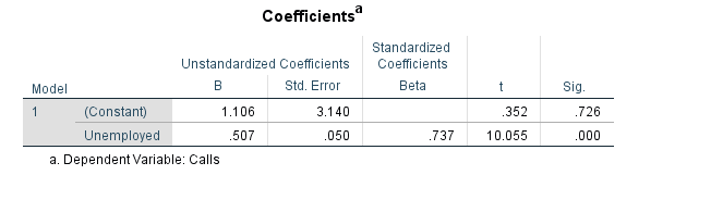
Step 1: The first step involves running a single regression analysis in SPSS using the Excel sheet of 911 calls in Portland.  Using Calls as the dependent variable, I then picked three separate independent variables to test against it.  The independent variables I chose to run were Alcohol Sales (AlcoholX), Unemployed, and Number of College Grads (CollGrads).  Looking at the R Squared values, slope, constant, and significance values for each output (found in the results section), I made conclusions.

Step 2: To obtain a visual of the number of 911 calls in each Census Tract, a choropleth map was made.  I chose a graduated colors map for this, with jenks natural breaks classification and 5 classes. The map is shown in figure 1 in the results.  The next map that needed to be made was a Standardized Residual map showing the independent variable I tested with the largest R squared value, which was Unemployed numbers.  In arcGIS, using the OLS option under spatial statistics tools, I generated a map showing standard deviations of residuals for Unemployed numbers in relationship with number of 911 calls (figure 2).  This shows how each tract deviates from the regression line.

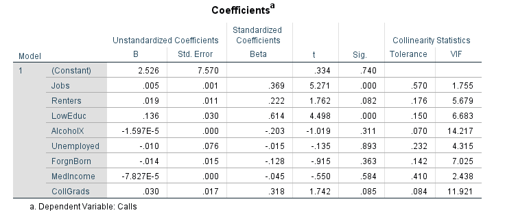
Step 3:  Next, in SPSS I ran a multiple regression report for all of the variables listed: (Calls (number of 911 calls per census tract), Jobs, Renters, LowEduc (Number of people with no HS Degree), AlcoholX (alcohol sales), Unemployed, ForgnBorn (Foreign Born Pop), Med Income, CollGrads (Number of College Grad)).  I turned on col linearity diagnostics to test for multicollinearity.  This would show if any two of the variables above are correlated with each other and possibly changing the significance level.  Lastly, a step wise approach was used with all the variables and a map was made from the results (figure 3).


Results:
Step 1 (single regression):  The first variable I ran as the independent variable was Alcohol Sales.  First, looking at the slope, b, in these results we can see that it is very tiny (3.069E^5), almost the equivalent of 0, so the best fit line is flat.  The best fit line would fit a line through the set of data points so the sum of the squared vertical distances of the observed points to the line is minimized.  So by looking at the slope equation we can see that for every one alcohol sale there is an increase in 911 calls by 3.069E^-5, which is basically nothing.  by looking at the R squared value, we can see that the independent variable of alcohol sales is not a very strong predictor of 911 calls.  So the strength of this relationship is not very strong because r squared is closer to 0 (.152) meaning alcohol sales do not explain 911 calls very much at all.  This also means that not very many points would be picked up, or follow the best fit line.  The null hypothesis in this case would state that there is no relationship between the X and the Y variables, and because we have a significance level of .049, this means that we reject the null.  There is a relationship but the strength is low.  

The next independent variable I tested was Unemployed.  The slope shows that the relationship between the two variables is positive, even though it is small (.507).  So as unemployment rises, 911 calls increase slightly.  The smaller slope means 911 calls, the dependent variable, is not very responsive to Unemployed numbers.  By looking at this we see that for every one person unemployed, calls will increase by .507 calls.  Next if we look at the R squared value, .543, we can see that it is between 0 and 1 so there is moderate strength of the relationship, or moderate ability of Unemployment explaining the variation in 911 calls.  The null hypothesis states that there is no relationship between Unemployed and 911 calls, and looking at the significance level of .726, we fail to reject the null.

The last independent variable I tested was Number of College Grads.  The slope (.029). indicates that the direction between the two variables is positive, but is relatively flat since the slope is close to 0. So we can see that 911 calls are not very responsive to the Number of college grads.  For every one college graduate in the area, 911 calls will increase by .029 calls.  Looking at the R squared value (.095) indicates that it is close to 0 so there is little strength in the relationship; College Grad numbers do not account well for the variation 911 calls.  The null hypothesis states that there is no relationship between the number of college grads and the number of 911 calls.  Looking at the significance level of .006 we can reject this hypothesis.  There is a relationship but its strength is very low.


Step 2 (choropleth and residual map):
The map (figure 1) below shows that the highest number of 911 calls occur in the center of the city, the class containing the most calls (67-176) occurring in the middle of the city and stretching to the north and south borders in the middle.  Almost all tracts on the east and west side of the city have classes containing the fewest amount of calls.
The next map (figure 2) shows how much each tract deviates from the regression line of the moderately correlated relationship between Unemployment numbers and the number of 911 calls in the city.  The darker red colors which occur in the center of the city indicate that these tracts contain values which deviate above the value calculated by the best fit line, so they would contain higher numbers of calls made than the value of calls indicated at the line for that particular value of Unemployed people.  We can see that this relates to the first map, with the higher number of calls occurring in the center of the city.  We can also see that the tracts shaded in blue contain values that deviate below the regression line at a value for Unemployed.  The darker blue the tract is, the farther it falls below the line for a certain point.  The blue falls mostly on the east and west half of the city.  About half the tracts on the map contain values which deviate above or below the standard deviation (tracts which are not yellow).  This corresponds with the r squared value of .543 because r squared shows how many tracts indicate variation in the explanation of the Y variable.  So about half the tracts have Y values which are different from the predicted value of Y at that point, or half explain the variation between 911 Calls and Unemployment.
Figure 1

Figure 2
Step 3:  After running all the variables together in a multiple regression report and testing for col linearity, the results are shown below.  We can see if multicollinearity is present by looking at the Eigen value and Condition Index.  Eigen values represent the amount of variation accounted for, in this case it is .014, which is close to zero and indicates further investigation is needed.  When we look at the condition index, it is under 30, which means multicollinearity is not present.  To understand which variables are most important in explaining the calls, the dependent variable, we look at the beta coefficients.  Beta is the amount the dependent variable increases when one independent variable increases one standard deviation and the others are held constant.  A larger beta means a greater influence the independent variable has.  In this case, the largest beta is from the Low Education variable, and the next highest are Jobs and College Grads.  This means that these are the three most important variables in explaining the number of calls.

To make sure that variance between the independent variables is not overlapping, I ran a step wise approach.  This analyzes the amount of contribution the variables make to the multiple regression equation.  This gives us the variables which best explain the relationship to the dependent variable.  Looking at the results we can see that this is renters, low education, and jobs.  A map of the residuals of these three variables is shown below (Figure 3). This map shows where and how much the number of calls deviates above or below the regression line of the three variables, or where there is variation in the explanation of how well the independent variable explain the dependent variables.  

Figure 3
Conclusion:  to answer the original study question of where to build a new hospital and the influences of the number of 911 calls, we can use the map above.  The independent variables of renters, Low Education, and Jobs are the best variables explaining the relationship with the dependent variable, number of calls.  This means that the best place to put a hospital would be where these three variables deviate above the predicted value of calls.  In this case that seems to be in the center of the city in the tract that appears red or the surrounding tracts which are a peach color.

Monday, April 24, 2017

Assignment 5

Part One:

For the first part of the assignment, correlation between various census tracts and population data in Milwaukee, WI were measured.  Correlation measures the association between pairs of variables. If we look at the Pearson Correlation, or how two variables change together, we can find strength, directions, or probability.  Strength of a correlation between two variables, or the Pearson's r value, ranges from 1, indicating the strongest correlation, to 0, indicating no correlation.  Picking out examples from the table above, if we look at the number of retail employees and the Hispanic population, the Pearson's Correlation is .058.  Because this value is in the 0 to .29 range, we can say that there is no correlation between the Hispanic population in the area and the number of retail workers.  This also means that it has no direction because there is no correlation, or a null relationship (Figure 1 below).  A null relationship means no difference in changing values of Retail Employee numbers and Hispanic population.  If we look at the relationship between retail employees and white population, the Pearson value is .722 indicating a high strength correlation, with the direction of the scatter plot being positive (Figure 2 below).  The significance level of .000 for this variable shows that it is highly significant because it is basically 100% and the two stars in the table indicate that in order to be significant, it must have 99%.  This significance means that we can reject the null, stating that there is a difference between the values for retail and white population.  So from this we can conclude that there is a significant strong correlation between numbers of retail employees and white population in census tracts in Milwaukee, or that higher numbers of retail employees are present in areas with higher white populations.  Another example we could look at is the relationship between median household income and black population.  The Pearson value for this is -.417 indicating a low, negative correlation as the scatter plot shows (Figure 3).  It is also given that this value is highly significant as well so we can reject the null and show that there is a changing difference between the variables.  This means that there is a low correlation, or slight negative change as median household increases, black population in the tract decreases. 


Figure1: Relationship between the number of retail employees and Hispanic population
Figure 2: Relationship between the number of retail employees and the white population

Figure 3: Relationship between Median household income and the black population

Part 2:


Introduction:


Testing for spatial autocorrelation illustrates how a variable correlates spatially with itself and can determine patterns in distribution and likeness.  Spatial autocorrelation determines the independence or randomness of spatial observations.  This information can be useful for analyzing patterns of voter turnout.  The Texas Election Commission has given data for 1980 and 2016 presidential elections, specifically democratic votes and turnout.  The goal is to analyze patterns from the elections and determine if there are any patterns of clustering for voting data.  This information will be used to determine how patterns have changed, if they have at all, over the 36 years.  We will also take a look at the patterns of clustering as related to variables in population, such as the Hispanic population correlation.  To do this, online correlation software including GeoDa and SPSS were used. 


Methodology:


To begin this task, data had to be collected from the U.S. census bureau website.  From the website, a shapefile of counties in Texas and a shapefile of Hispanic population 2015 data in each Texas county were downloaded.  Because the Hispanic population shapefile contained data that was not necessary for the analysis, the ID row was deleted and all columns but the column containing percent of Hispanics in each county were deleted.  Voting data with voter turnout for 1980 and 2016 and percent democratic vote for 1980 and 2016 for the state of Texas was provided for this task.  Next, the data was then imported into GIS as Excel tables, joined with the Texas counties shapefile, and exported as another shapefile in order to use all the information collectively in GeoDa.  Once in GeoDa, a spatial weight had to be created to determine spatial autocorrelation for the election data and Hispanic Populations.  With the weight determined, the Moran's I scatter plot and LISA cluster maps could be created.  The Moran's I plot compares the value of the variable at one location with the value at other locations.  It can vary between -1 and 1, with positive values being closer to 1, meaning more clustered and a higher strength coefficient.  Negative values mean data is less clustered.  It is broken down into four quadrants with positive and negative numbers for comparisons.  The LISA (local indicators of spatial autocorrelation) maps provide a way of visualizing this spatially.  Both of these are used to measure what one place has in common with a neighboring place. 


Results:


From the LISA maps, we can see that in the 1980 elections, there was a cluster of counties in the very southern portion of the state that had low voter turnout and were surrounded by other counties with low turnout as well.  It can also be seen that counties slightly further north around the San Antonio area, and counties in the very northern portion of the state had clusters of high voter turnout (Figure 1).  There was also a cluster of counties with low voter turnout surrounded by other low turnout counties along the middle, eastern side of the state. Compared to voter turnout in the 2016 election, results were somewhat similar.  In 2016, the cluster of high-high voters in the very northern portion of the state got smaller by several counties.  The low-low cluster on the eastern side disappeared.  Comparing the Moran's I values, the 1980 value was .468 and the 2016 value was .2875.  On the scatter plots, the points in 2016 also appeared more loosely associated.  This means that in 1980 voter turnout was more positive, or clustered and 2016 was less clustered in comparison.


    Figure 1:(1980 on left, 2016 on right)


Next we can compare the percent of democratic votes in the counties between the two years 1980 and 2016.  In 1980, the percent of Democratic voters had low-low clusters in the north-west portion of the state and in the San Antonio region.  The very southern portion and various counties in the west, including a few around Dallas, had occurrences of high values surrounded by other high values.  There were very few high-low and low-high relationships.  In 2016, the percent of democratic voters had low-low clusters in the north central portion of the state, and the San Antonio region gained more white counties, or counties with no significance.  The very southern portion of the state gained a few more counties with high-high values, and the very western portion of the state went from counties with no significance to a few larger counties with high-high values (Figure 2).  The Moran's I value in 1980 was .5752 and the value in 2016 was .6855.  This means that in 2016 the percent democratic voter patterns became more clustered, therefore the coefficient is higher.  We can see this on the scatter plot in 2016 because the points fall closer to the middle of the chart Figure 3).  This also shows that there is a higher clustering of low-low values, as most of the points fall in the bottom left corner, which indicates (-,-) values. 
Figure 2: Percent Democratic Vote in 1980 on left, 2016 on right


Figure 3: Moran's I for 2016 Democratic Vote
Lastly, we can compare both of the above results to make conclusions about how the Hispanic population has an effect on voter turnout and percent democratic vote.  Looking at the LISA cluster map of percent Hispanic population in each county, the state is mainly divided up into two regions.  The southwest portion has high values of Hispanic people surrounded by counties with other high values, and the northeast portion has low-low values.  The Moran's I value is .7787, which indicates a positive relationship with a high amount of clustering.  (Figure 4)
Figure 4


Conclusion:

From the results, we can see that voter turn out lost clusters of high values neighboring other areas of high values.  We can also compare to Hispanic population clustering to note that the counties with high spatial correlation of Hispanic people have lower percentages of voter turnout.  Running the data in SPSS, we can see that the Pearson Correlation value, which measures how two variables change together, is stronger in 2016 (-.637) than in 1980 (-.407) and both of these values are significant.  This means that we can reject the null stating there is no difference and conclude that as percentage if Hispanic population gets higher, voter turnout gets lower, it is a negative relationship.  The governor of the state can then conclude that as Hispanic populations rise in certain counties in the Southwest, voter turnout will decrease.  We can also compare Hispanic population to percent Democratic vote in each county as well.  From the maps in figure two, it appears that percent of non democratic votes has shifted east ward in the state and percent democratic vote has gathered become more clustered in the south west.  We can also see that in 2015, the south west had high clusters of Hispanic population.  If we look at the correlation in SPSS, we can see that the Pearson Correlation for percent democratic votes and Hispanic population is .721, indicating a strong positive correlation.  As the chart shows below, however, most points occur in the low-low range because of poorer voter turnout.  But it is significant, so we can reject the null and state that there is a difference, as percent democratic vote rises, so does the percent of Hispanic population in each county.  It can also be said by looking at the maps that voter turnout is lower in areas with higher percentages of democratic voters.  The 2016 Pearson correlation value for % democratic votes and voter turnout is -.564.  This is a positive, moderate correlation, indicating that as democratic votes go up, voter turn goes down. 

Correlation between voter turnout and Hispanic Population

Correlations
 
VTP80
VT16
HD02_S02
PRes16D
Pres80D
VTP80
Pearson Correlation
1
.525**
-.407**
-.530**
-.612**
Sig. (2-tailed)
 
.000
.000
.000
.000
N
254
254
254
254
254
VT16
Pearson Correlation
.525**
1
-.637**
-.564**
-.286**
Sig. (2-tailed)
.000
 
.000
.000
.000
N
254
254
254
254
254
HD02_S02
Pearson Correlation
-.407**
-.637**
1
.721**
.093
Sig. (2-tailed)
.000
.000
 
.000
.139
N
254
254
254
254
254
PRes16D
Pearson Correlation
-.530**
-.564**
.721**
1
.391**
Sig. (2-tailed)
.000
.000
.000
 
.000
N
254
254
254
254
254
Pres80D
Pearson Correlation
-.612**
-.286**
.093
.391**
1
Sig. (2-tailed)
.000
.000
.139
.000
 
N
254
254
254
254
254
**. Correlation is significant at the 0.01 level (2-tailed).